Reading Heatmaps Like a Diagnostic Tool
Most teams install heatmaps, glance at the pretty colors, and move on. That's a missed opportunity. Heatmaps are one of the most powerful diagnostic tools in your optimization toolkit, but only if you know what patterns to look for.
A heatmap doesn't just show where users click. It reveals intent, confusion, and frustration. Users click where they expect something to happen. They scroll until they lose interest. They hover where they're reading or deciding. Each of these behaviors tells a story about your page's effectiveness.
Here are five heatmap patterns that consistently signal conversion problems, and what to do about each one.
Pattern 1: The Ghost Click Zone
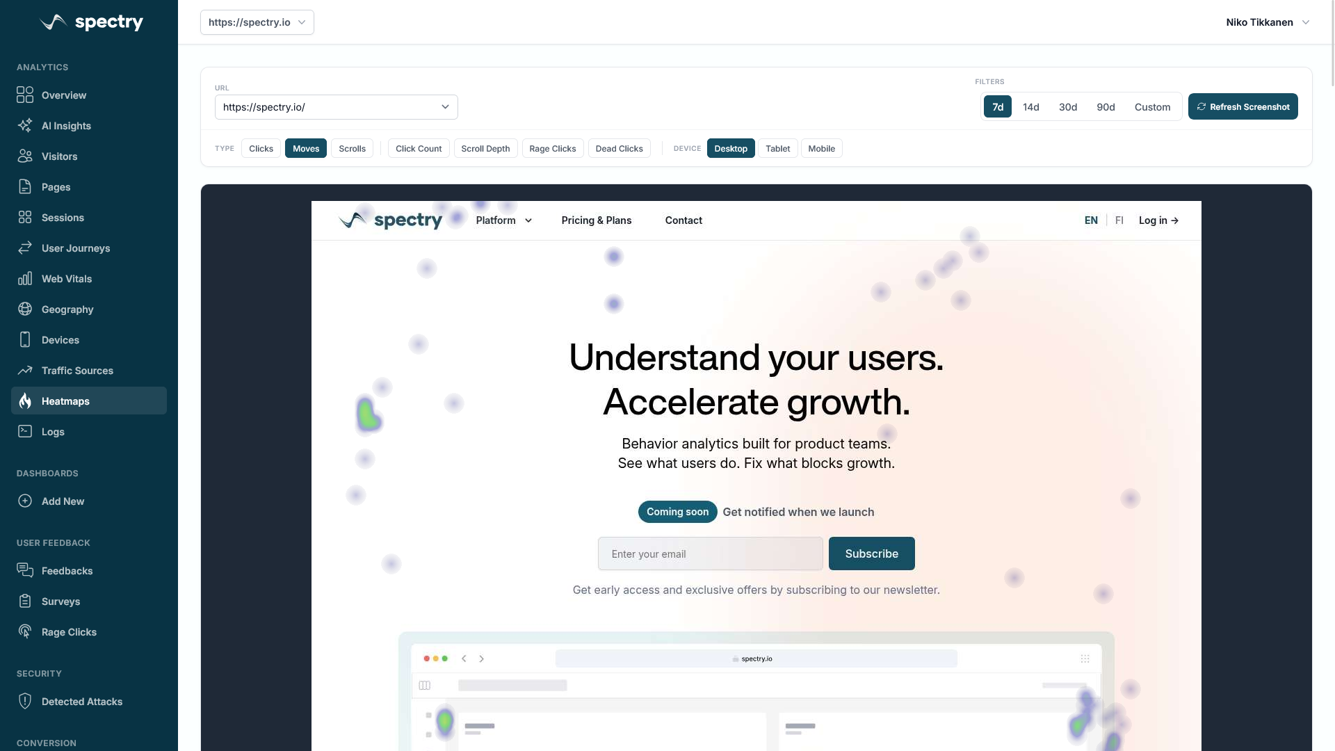
You see a cluster of clicks on an element that isn't interactive, an image, a piece of styled text, or a card that looks clickable but doesn't actually link anywhere.
What it means: Users expect this element to do something. Your design is creating a false affordance. Every ghost click is a micro-frustration that erodes trust and moves users further from conversion.
How to fix it:
- If the element should be clickable, make it a link or button. Users are telling you what they want.
- If it shouldn't be clickable, restyle it. Remove hover effects, button-like borders, or underlines that suggest interactivity.
- Check your click heatmap across devices. Ghost clicks often differ between desktop and mobile.
According to research by the Nielsen Norman Group, users form expectations about interactivity within 50 milliseconds of seeing an element. If it looks clickable, they'll click it.
Pattern 2: The Scroll Cliff
Your scroll heatmap shows a sharp drop-off at a specific point on the page. Above that point, 90% of users are present. Below it, only 20% remain.
What it means: Something at or near that boundary is causing users to stop scrolling. Common culprits include:
- A large image or hero section that creates a "false bottom", users think the page has ended.
- A content section that doesn't match user expectations, causing them to lose interest.
- A slow-loading section that creates a blank gap, breaking the scroll momentum.
How to fix it:
- Audit the area around the drop-off. Is there a visual cue that the page continues (like a partially visible section)?
- Move your most important content and CTAs above the scroll cliff.
- Use directional cues, arrows, partial content teasers, or "keep scrolling" indicators, to encourage users to continue.
- Check page load performance. If content below the fold loads lazily and slowly, users won't wait.
Pattern 3: The Ignored CTA
Your primary call-to-action button shows almost no click activity on the heatmap, even though the page receives significant traffic. Meanwhile, secondary elements (navigation links, footer links, or even social media icons) get more clicks.
What it means: Your CTA is either invisible, unconvincing, or positioned where users don't look. This is one of the most costly heatmap patterns because it directly represents lost conversions.
How to fix it:
- Check contrast: Does the button stand out from its surroundings? Use sufficient color contrast against the background.
- Check position: Is the CTA visible without scrolling? If it's below the fold, does the scroll heatmap show users actually reaching it?
- Check copy: Generic text like "Submit" or "Learn More" underperforms specific text like "Start Free Trial" or "Get My Report."
- Check proximity: Is the CTA near the content that motivates action (testimonials, benefits, pricing)?
A/B test different CTA placements and copy. Even moving a button 200 pixels can dramatically change click rates.
Pattern 4: The Form Field Hotspot
Your click heatmap on a form page shows disproportionate clicks on one or two specific fields. Users are clicking on those fields far more than others, suggesting repeated clicks, corrections, or confusion.
What it means: Those form fields are causing friction. Users might be:
- Confused by the label or placeholder text
- Fighting with input validation that rejects their entries
- Trying to interact with a dropdown or date picker that isn't working properly
- Clicking a field that doesn't gain focus on the first click (common with custom-styled inputs)
How to fix it:
- Pair the heatmap data with session replays filtered to that page. Watch what users actually do with those fields. In tools like Spectry, you can click directly from the heatmap insight into relevant session recordings.
- Simplify labels. If a field needs explanation, add helper text below it.
- Test your form on multiple browsers and devices. Custom form components often break in unexpected ways.
- Consider removing the problematic field entirely. Every field you remove increases completion rates, Baymard Institute research shows the average checkout has 12 form fields, but most could operate with 7.
Pattern 5: The Navigation Bail-Out
On a landing page or conversion page, your heatmap shows the highest click concentration on the navigation menu. Not on the page content or CTAs. Users are actively looking for a way off the page.
What it means: The page isn't meeting user expectations. They arrived (from an ad, email, or search result), quickly determined this isn't what they wanted, and are using the navigation to find what they actually need.
How to fix it:
- Check message match: Does the landing page headline match the ad or link that brought users there? Mismatched messaging is the top cause of immediate bail-outs.
- Check the first screen: Does the content above the fold clearly communicate what the page offers and who it's for? You have roughly 5 seconds to convince a user to stay.
- Consider removing navigation: On dedicated landing pages, removing the nav menu can increase conversions by 20-30% according to Unbounce research, because it eliminates escape routes.
- Segment your heatmap data: Look at heatmaps for different traffic sources separately. Users from Google search may behave very differently from users who clicked an email link.
Turning Patterns Into Improvements
The real power of heatmap analysis comes from combining it with other data sources. A heatmap shows you where the problem is. Session replays show you what users experience. Funnel data shows you the impact on conversions. And A/B testing validates whether your fix actually works.
Spectry integrates all of these into a single workflow: spot the pattern in the heatmap, dig into replays to understand it, measure the funnel impact, then test a solution. This closed loop is what separates teams that guess from teams that optimize.
Start by pulling up heatmaps for your three highest-traffic pages. Look for these five patterns. Chances are, you'll find at least one conversion leak you can fix this week.